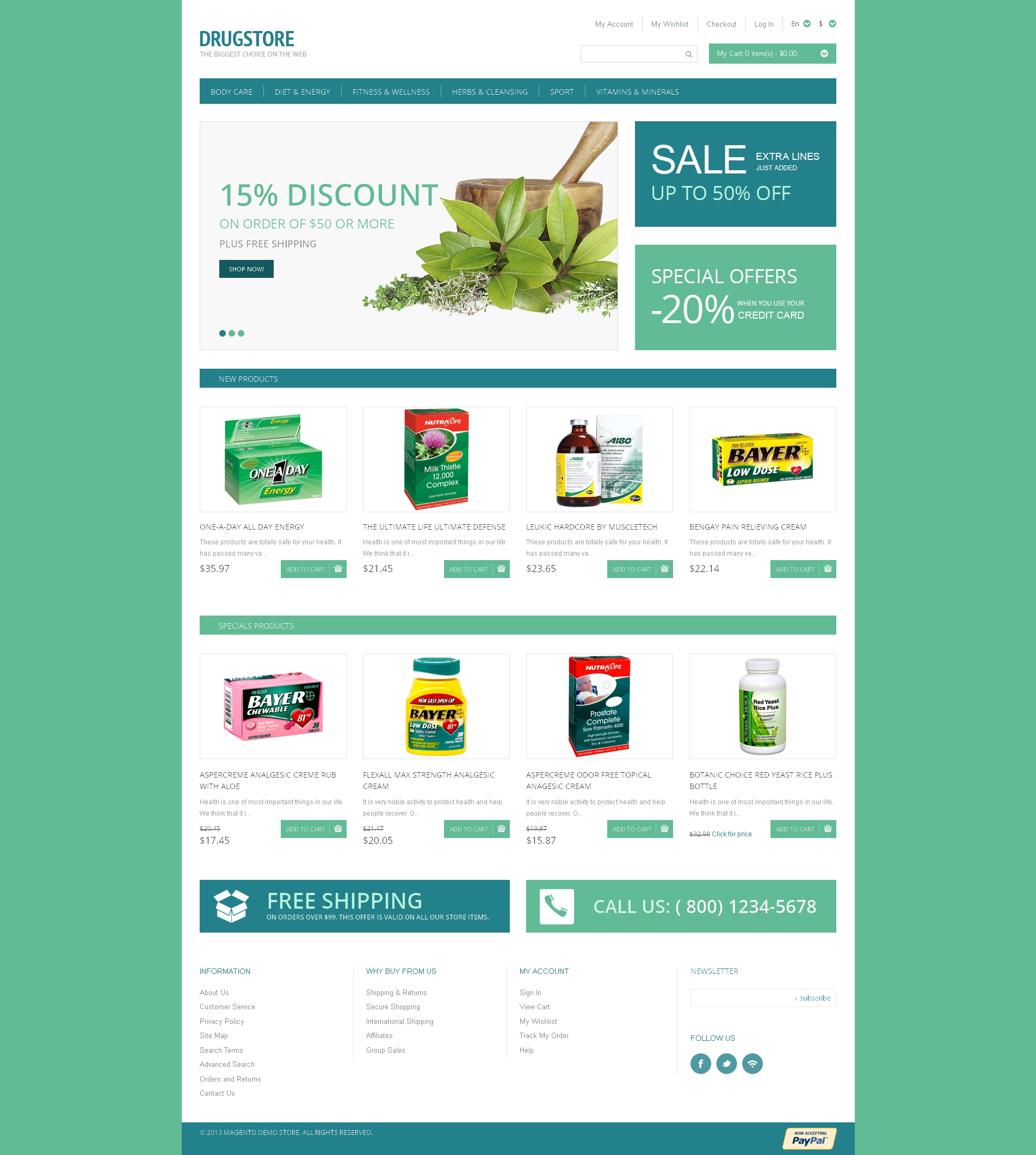
Description
Green and light blue are the most common colors that are used in medicine websites. They communicate the idea of healthy life and set a calm tone up. Besides, these two colors are used for visual separation of content blocks and emphasizing some key parts in the following design. Promotional banners and featured blocks, colored in green blue, easily catch the viewers attention. Wellorganized list of product items stands out against the white background. Green ‘Add to Cart’ buttons unobtrusively offer to make a purchase. Do it!
TemplateMonster MarketPlace
TemplateMonster is a marketplace where you as a designer or developer may sell your Web Design Software, Website Templates, Design Elements, Plugins and Extensions. Become a digital products vendor and earn up to 70% from each sale.
This Business Firm Magento design template is Search Engine Friendly
What is it?
Search Engine Friendly is the type of website design that enables the search engine to examine and index its pages.
Why is it Good?
SEO helps to make it to the top of Google search results and match the ranking factors required by the most common search engines. Thanks to that your website is visible on the web.
Find latest Search Engine Friendly Magento design templates here
This Corporate Magento template is Responsive
What is it?
Responsive layouts adapt to little and greater display screen sizes mechanically.
Why is it Good?
Responsive web design helps to strengthen user experience and give a 100 % access to the website page data from any gadget.
Find more Responsive Magento designs here
Additional information
| Live URL | |
|---|---|
| Topic | Drug Store Templates, Medical Templates, Business & Services, Fashion & Beauty |
| Tags | capsules, care, cure, disease, drugs, healthy, medical, medicaments, medicare, medicine, medicines, ointment, online, pharmacy, pills, prescription, store, supplements, supplies, tablets, vitamins |
| Features | Admin Panel, Dropdown Menu, Google map, HTML 5, HTML plus JS, JQuery, Online Store/Shop, Responsive, Sample content, Search Engine Friendly, Sliced PSD |
What is included?
- Template
- Installation of the latest WordPress of Woocommerce version
- All demo content. Site will be delivered as it is (so like the demo works it will be delivered)
- Email setting, so contact forms email is send to you
- Hosting with SSL and email
- Cache module
- Extra hack security
What's Optional:
- New logo
- Other colors
- Other content delivered by you or made by us
- Payment gateway
- Extra plugins installed
- Basic SEO (Search engine) settings
- Complete SEO (Search engine) settings
- Feeds for Google, Bing, marketplaces etc.
- Design changes
- Social media integration
- Widget customization
- Uptime monitor


