Adeline – Young Couple Photo Album Photography WordPress Theme
€ 99,00 incl. 21% NL VAT
Description
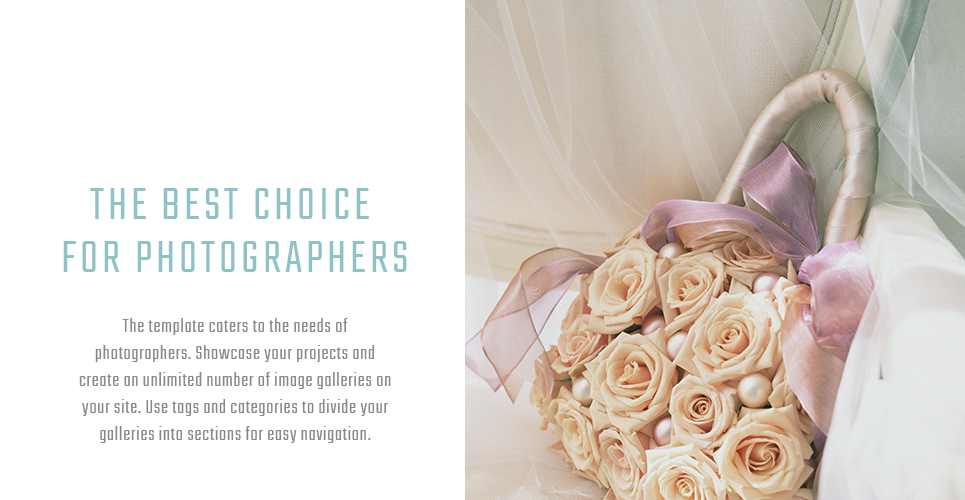
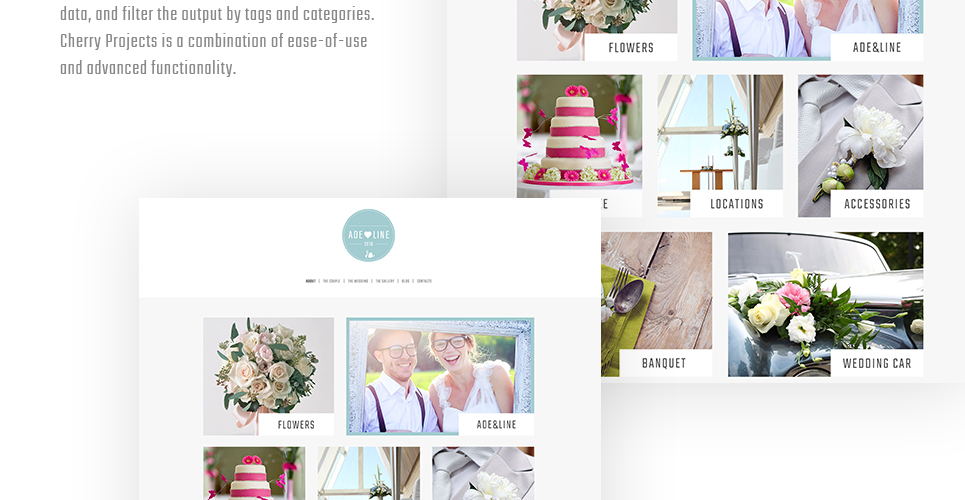
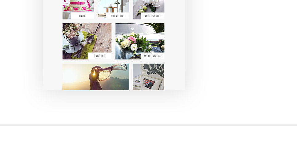
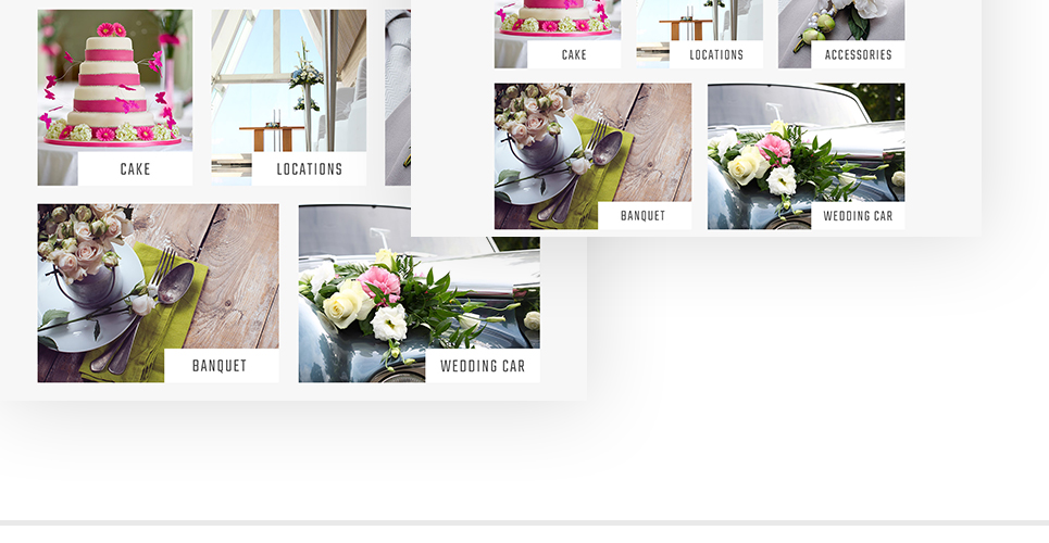
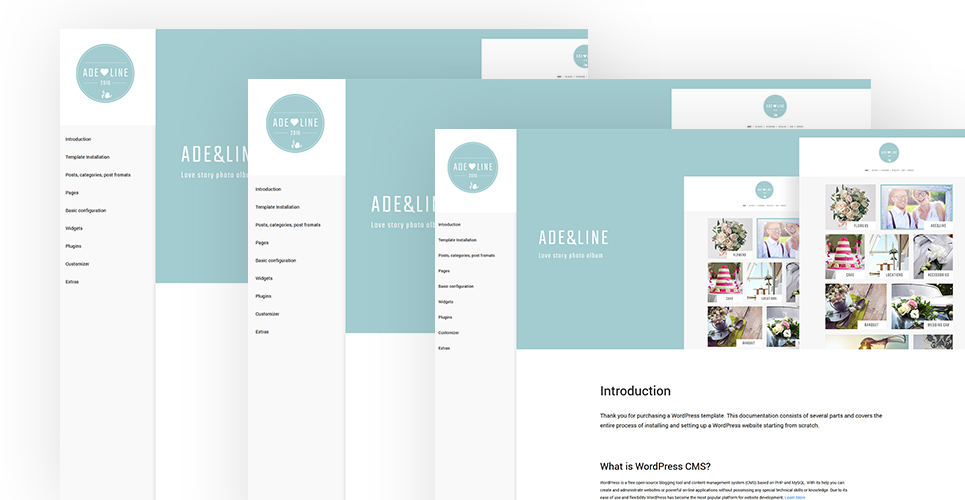
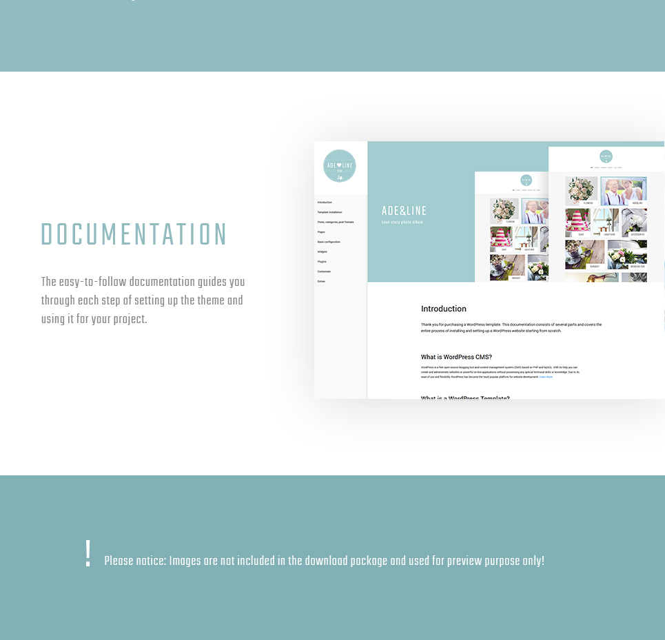
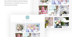
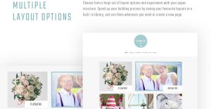
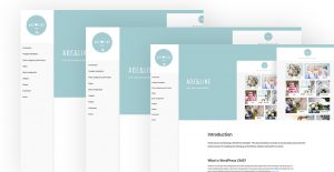
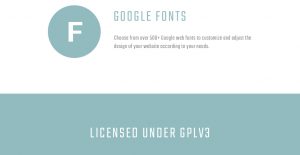
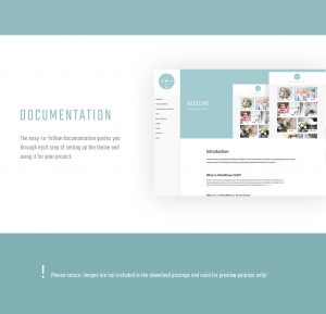
Adeline is a minimalist Wedding Accessories WordPress Theme with a modern photography-focused grid homepage layouts and a selection of blog styles. Supplemented with a powerful photo gallery based on Cherry Projects module, this theme is a great way to build a personal portfolio, or your own photo album, which you can use to tell your love story to your friends. The clean design of Adeline is rich with pictures and creative typography fully powered by web-friendly Google Fonts. You can easily modify the look of your website using Live Customizer and Power Builder, which provide great flexibility and allow for changing any design element. Adeline comes with a detailed documentation, which will clarify all the ins and outs of its installation and customization.
This Web Photo Gallery WordPress theme is WPML ready
What is it?
WPML is a function which allows to make your web page multilingual.
Why is it Good?
WPML ready themes are the ones that can be translated and used in various languages.
Latest WPML ready WordPress themes here
This Web Photo Album WordPress theme is Search Engine Friendly
What is it?
Search Engine Optimized design templates were built to draw in consumers and internet search engine crawlers to your internet site.
Why is it Good?
SEO friendly web design means that the website will be properly indexed and ranked higher by the search engine.
Click for more Search Engine Friendly WP themes here
This Photo Gallery WordPress template is Retina Ready
What is it?
Retina ready approach refers to a high-resolution display, where pixel density can be so high, so the person’s eye can’t figure out specific pixels.
Why is it Good?
Apple devices were 1st to get Retina display screens, yet right now their opponents use that technology too. A large number of mobile phones and tablets have Retina display screens, so in case you want your web site to seem ideal for pretty much every site user – you’ll need a Retina-ready design template.
Newest Retina Ready WordPress design templates here
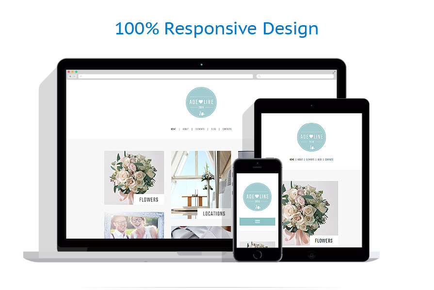
This Photo Courses WordPress design is Responsive
What is it?
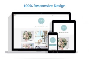
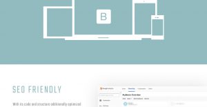
Responsive design is a method of web design that allows web pages to adapt to a screen size of pretty much any gadget – whether it’s a personal computer, a tablet or a mobile.
Why is it Good?
It is great because the website is available for more users from the huge variety of gadgets.
Latest Responsive WordPress templates here
This template is featured in the following editorial reviews:
Additional information
| Live URL | |
|---|---|
| Topic | Photography Templates, Photo Gallery Templates, Design & Photography |
| Tags | art, camera, cameras, cms, company, convert, digital, gallery, models, photographer, photography, photos, picture, pictures, portfolio |
| Features | Admin Panel, Advanced Theme Options, Blog, Dropdown Menu, HTML 5, JQuery, Responsive, Retina Ready, Sample content, Search Engine Friendly |
What is included?
- Template
- Installation of the latest WordPress of Woocommerce version
- All demo content. Site will be delivered as it is (so like the demo works it will be delivered)
- Email setting, so contact forms email is send to you
- Hosting with SSL and email
- Cache module
- Extra hack security
What's Optional:
- New logo
- Other colors
- Other content delivered by you or made by us
- Payment gateway
- Extra plugins installed
- Basic SEO (Search engine) settings
- Complete SEO (Search engine) settings
- Feeds for Google, Bing, marketplaces etc.
- Design changes
- Social media integration
- Widget customization
- Uptime monitor

